Thunderhorse Hollow Farm
Launched August 2025
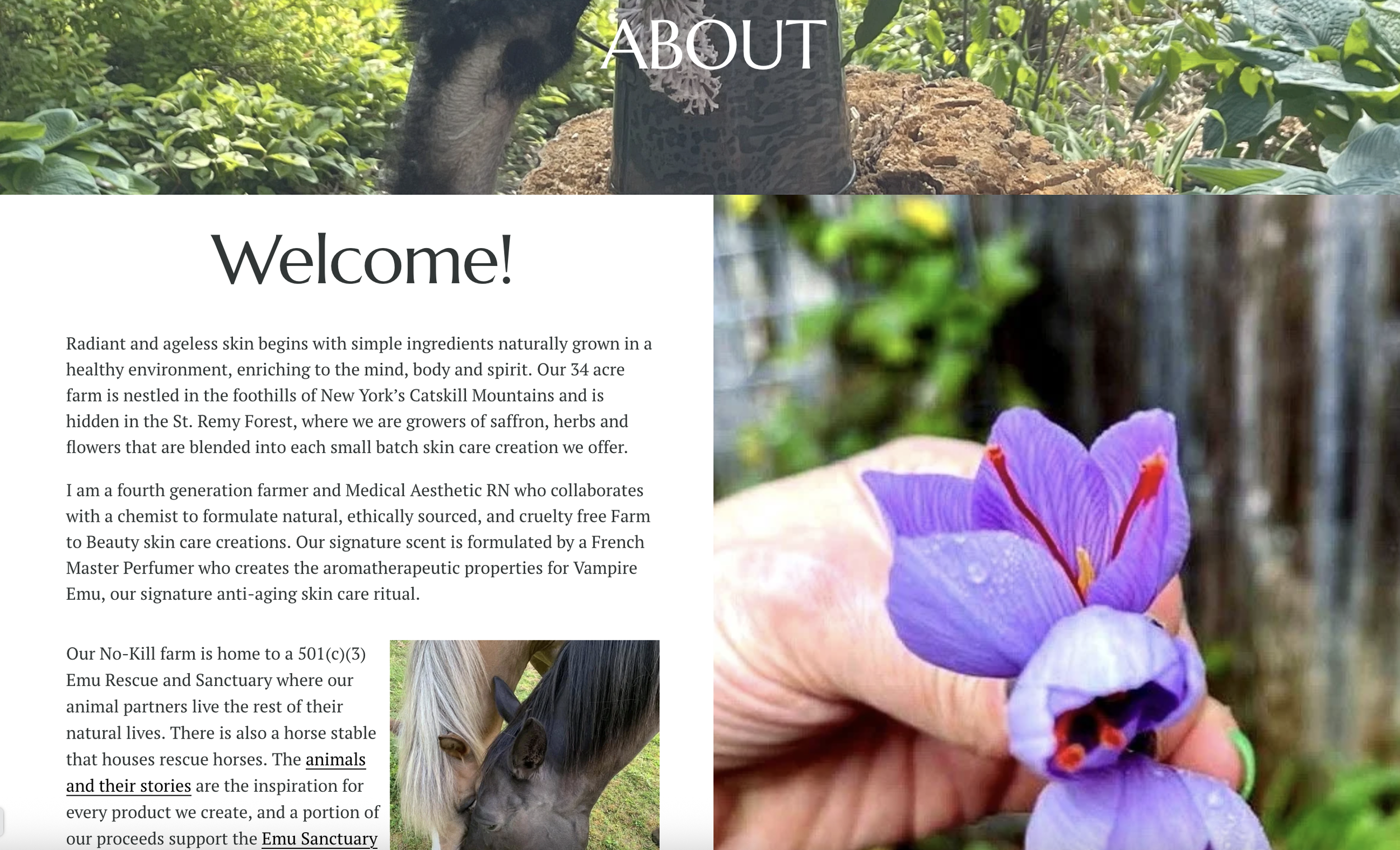
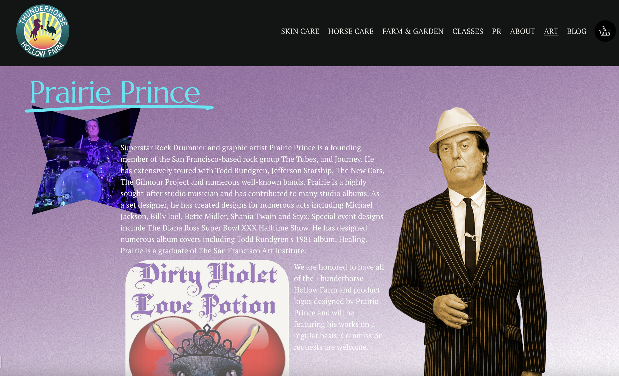
Completed with an agricultural grant from Ulster County, Thunderhorse Hollow Farm was a complete redesign of the original website. The client wanted a different relationship with a new design team, and hired Katie James, Inc. to be their partner.
Special Features
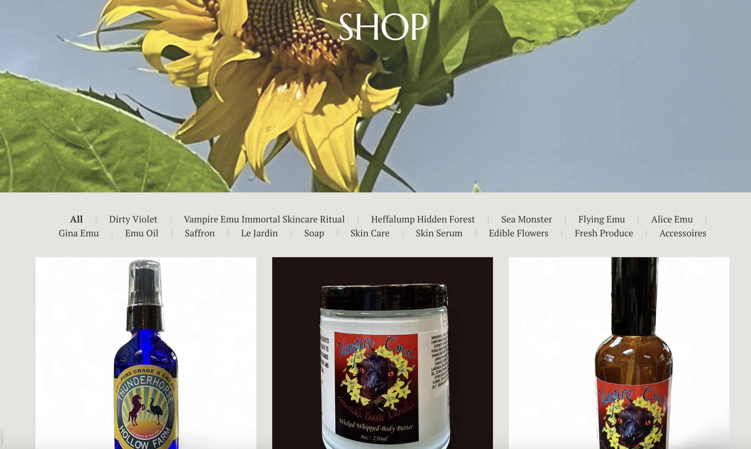
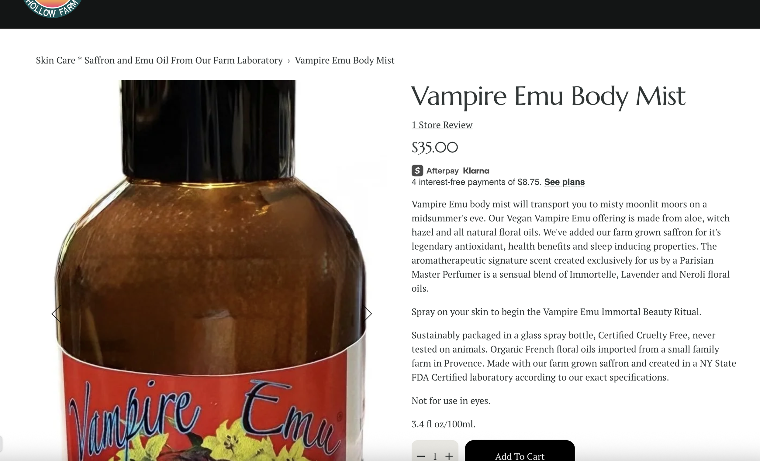
Selling the skincare line, flowers and emu eggs.
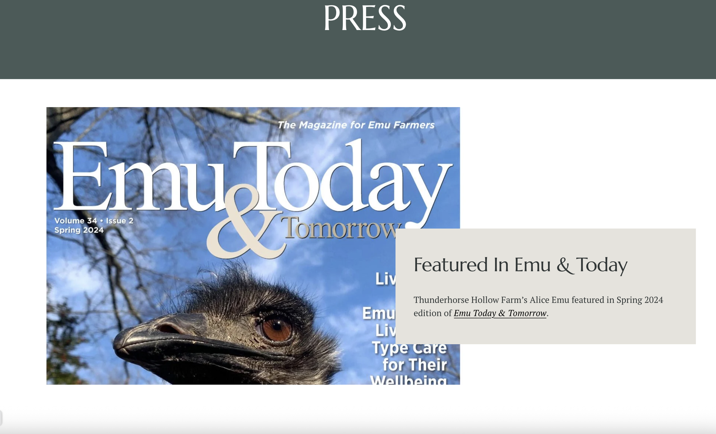
Highlighting media features and podcasts.
Listening to the client to incorporate how she wanted to show her goth style in a farm fresh atmosphere.
Teaching the client how to make changes herself.
Dear Summer Festival
Launched August 2025
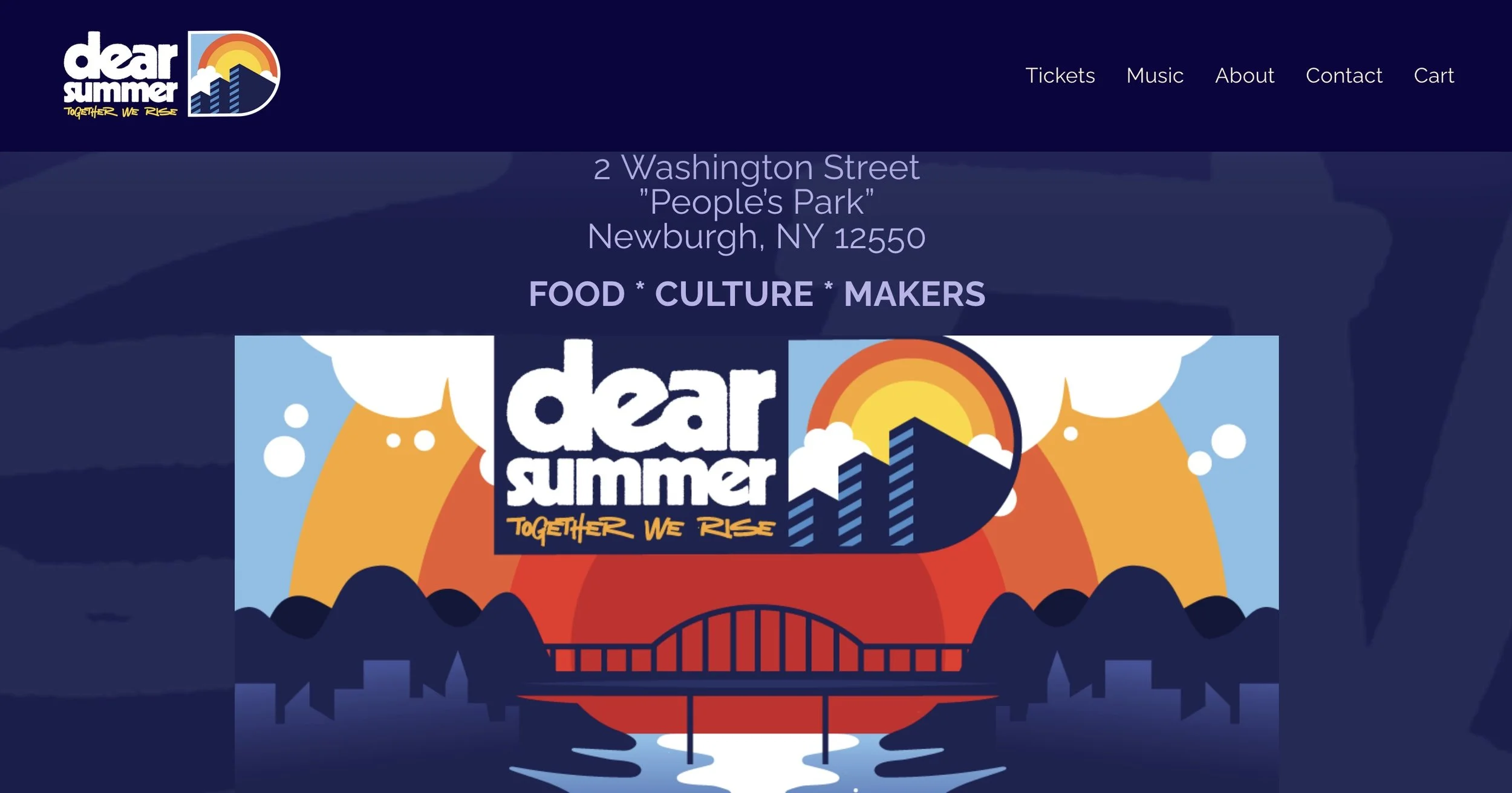
Collaborated with the client’s designer to use their logo and graphic elements to illustrate different pages to sell tickets and inform festival goers about what to expect.
Special Features
Creating the online destination of this festival with room to grow.
Festival information about music, food and vendor opportunities.
Set up ecommerce to sell tickets and vendor participation.
Miz Hattie’s BBQ
Launched: January 2021
Customers love Miz Hattie’s Southern Style BBQ so much, they were asking her to let her order online, and several customers offered to build a website for her. Miz Hattie came to Katie James, Inc. with the project, and we went to work combining her new online menu via Toast with a new website that showcases her catering and other services.
Special Features
Integrate Toast into the website and Instagram.
Work one-on-one with Miz Hattie to streamline her menu and add descriptions to help customers know what they are ordering. Miz Hattie is used to answering questions from customers over the counter. Katie James, Inc. knows that customers in an online space are different, and might not take the time to email a question and wait for an answer. We want to help her seize the seconds that the customers have tapped into Toast to place their orders!
Barb’s Butchery
Launched: September 2020
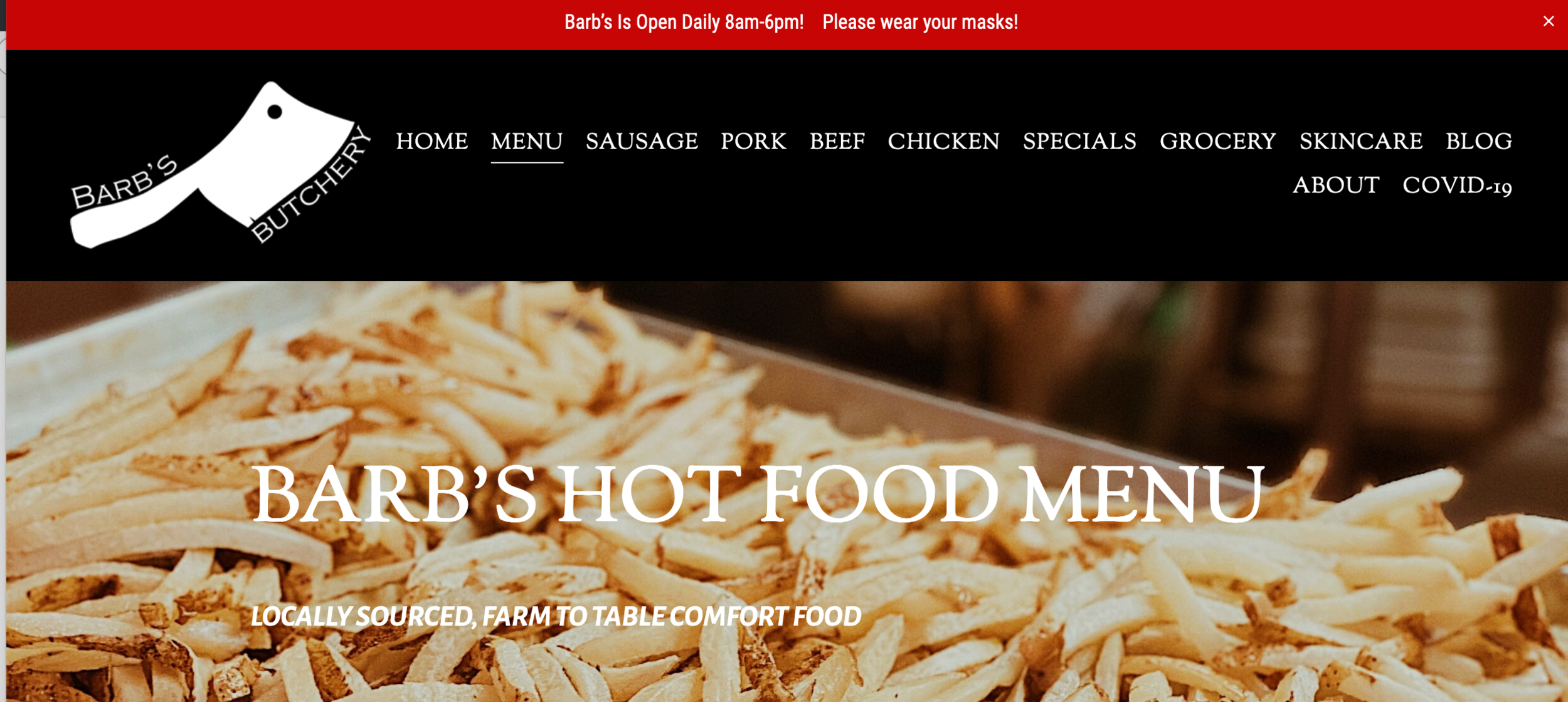
Beacon’s favorite local butcher wanted a new website to modernize her online look. Paramount to Barb was that she could work the herself, and that it had easy ecommerce ability should she wish to sell from the website, in addition to her Square POS platform options.
Special Features
Beautiful homepage to make meat look appealing, and the shop inviting.
Room for expansion into ecommerce for Barb’s new skincare line. In full nose-to-tail spirit, Barb has been making tallow based candles, balms, hair conditioner, and other products.
Training was given to Barb to teach her how to add images herself and keep the website fresh. She can change the home page to say when their are closed or to swap out a photo. She can also add monthly specials, and contribute news items to her blog/news section.
Cold Spring Fitness
Launched: May 2018
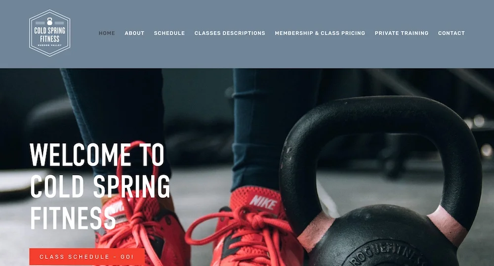
This boutique fitness studio has been important to many people in Cold Spring, and throughout the Hudson Valley, really, including Katie! She is a member there. When she got word that the former studio was closing (On The Fly Fitness), she reached out to the owner to offer consultation in building up and managing a membership. Membership is no easy task, but one that can be very rewarding if done right. Katie has enjoyed a client relationship with Dawn Scanga of Cold Spring Fitness ever since.
Special Features
Moved the website out of Weebly and into Squarespace, which is an easier platform to manage and make quick changes, or more robust enhancements.
MindBody Deep Dive. We are specialists in speaking "database" lingo to 3rd party database management systems and their customer support specialists. While Cold Spring Fitness was learning MindBody, Katie was there to learn how to better operate that membership management and class signup software.
Training was key to Dawn, who is a master trainer herself for the body. Katie trained Dawn in setting up a few business systems to get things running efficiently. Katie also encouraged Dawn to take the newsletter on herself (working the MailChimp) and has been watching Dawn's improvement ever since. Katie James Inc. does offer to produce newsletters for clients on a retainer basis, but also serves as a support system to those keeping it in house to do it themselves.
Main Street Summit
Launched: June 2017
Beacon, NY is in a time of resurgence and fast growth in different sectors. Two well known community based businesses, BEAHIVE and A Little Beacon Blog, teamed up to produce a summit to bring business owners, managers and city leaders together to discuss issues of the day in person, and to learn from each other. InHouse Design Media created the website based on branding created by local designer Daniel Weise of Thundercut.
Special Features
This landing page based website provides readers with all of the information on one page, but offers direct links to specific pages, should direct links to Ticket sales pages be required.
Tickets and Sponsorships are sold directly from this website, using Squarespace's ecommerce build-in tools.
Key to this landing page is maintaining the navigation following down the page, anchored in the dark color to help readers see what is available at-a-glance
The Telephone Building
Launched: June 2017
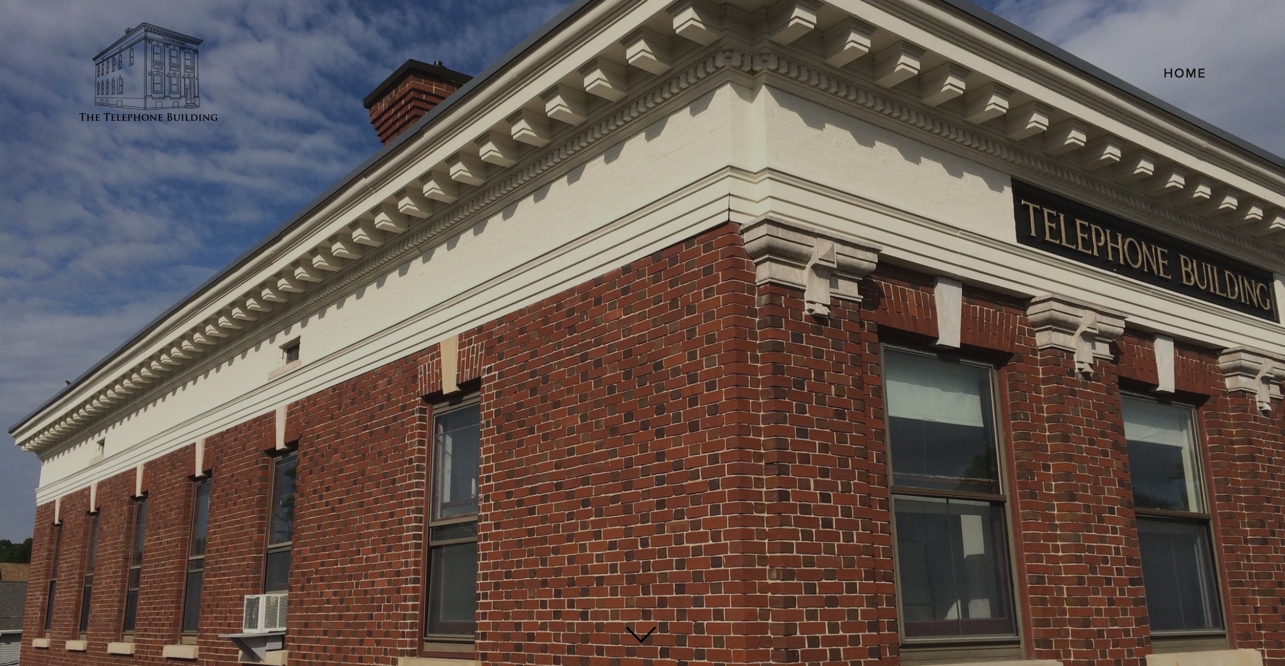
Deborah Bigelow is a restoration artist who works within her company Gilded Twig. Gilding in gold is her specialty. Little known is her business of owning and restoring a building. In the late 1990s, Deborah bought a building at 291 Main Street that was an original Telephone Building built in 1907. This building became her artistic project, and she has restored all of it. The building's offices are rented out to different tenants. In 2017, Deborah was ready to brand the building and her second business, 291 Main Street LLC.
Special Features
The website is on one page, which is essentially a Cover Page. While we did not use the actual Cover Page tool in Squarespace, the effect is the same, yet with more depth.
The website can easily be expanded with more pages and photos when the client is ready.
Stanley Lindwasser
Launched: May 2017
Stanley and his wife Helen came to us after relocating to Beacon and wanted to start an in-person relationship with a web team to help showcase his decades of work as a professional artist. We inherited the start of a portfolio website in Squarespace. After meeting with Stanley and Helen to hear their likes and dislikes, top priorities and styles they had no position on, we went to work to complete it in time for Stanley's first participation in Beacon's Open Studios for 2017.
Special Features
Home page as a block of color, which is one the paintings from Stanley's 2017 collection. As an artist, Stanley immerses himself in color and the lines making up the color as he paints. He doesn't like to interrupt someone's viewing experience with a lot of words. Therefore, the paintings dominated here.
The Resume page became a balance of a listing of accomplishments, highlighted with pictures of examples.
One day, Stanley may commit to a Blog or News section, in order to illuminate the behind-the-scenes of his paintings, and involvement with projects.
Beacon Chamber of Commerce
Launched: January 2017
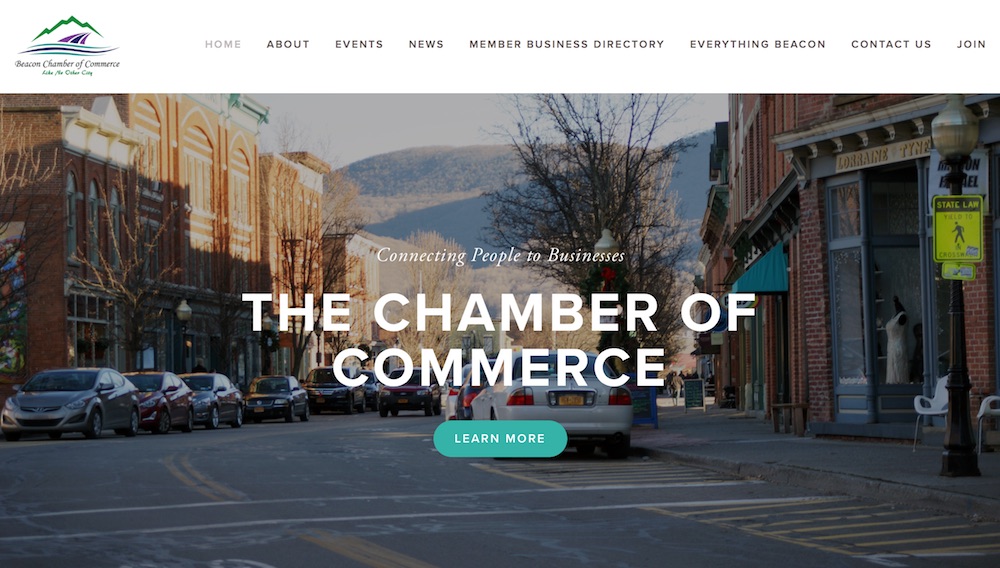
The Beacon Chamber of Commerce had been grappling with their website for a number of years. Having high hopes for it, different board members joined and offered their services to update it, but found their hands tied when attempting to do the work. The website was in WordPress, and under-the-hood just wasn't clicking for them. We evaluated the website before recommending a switch to Squarespace, and when we discovered that a person would need to change an event on the home page in three very different places, we deemed it not user-friendly for a group of people who are not fluent in updating websites.
Special Features
Member Directory was created and is maintained.
Multiple forms by way of Google Doc Spreadsheets have been created in order to set up systems for several board members to work together remotely. This includes capturing inquiries from the website, and setting up automation for processing and getting a new member into the system.
Introduction of an easy way to join and pay the Chamber online. The former way was to physically walk an application to a store owner, and collect or be mailed a check. The Chamber utilizes a membership management program called Recurly in for its annual rebilling membership program.
Creation of Intake Forms for people who want a Ribbon Cutting or to submit themselves as a speaker, and other internal systems.
Training in different apps to coordinate the different board members.
Presentation of several calendars to make Chamber Produced Events as well as Member Produced Events easier to find on the website. Not only did we create a design of different calendar spreads, but we do update the website with new events and members.
Mugi Pottery
Launched: September 2016
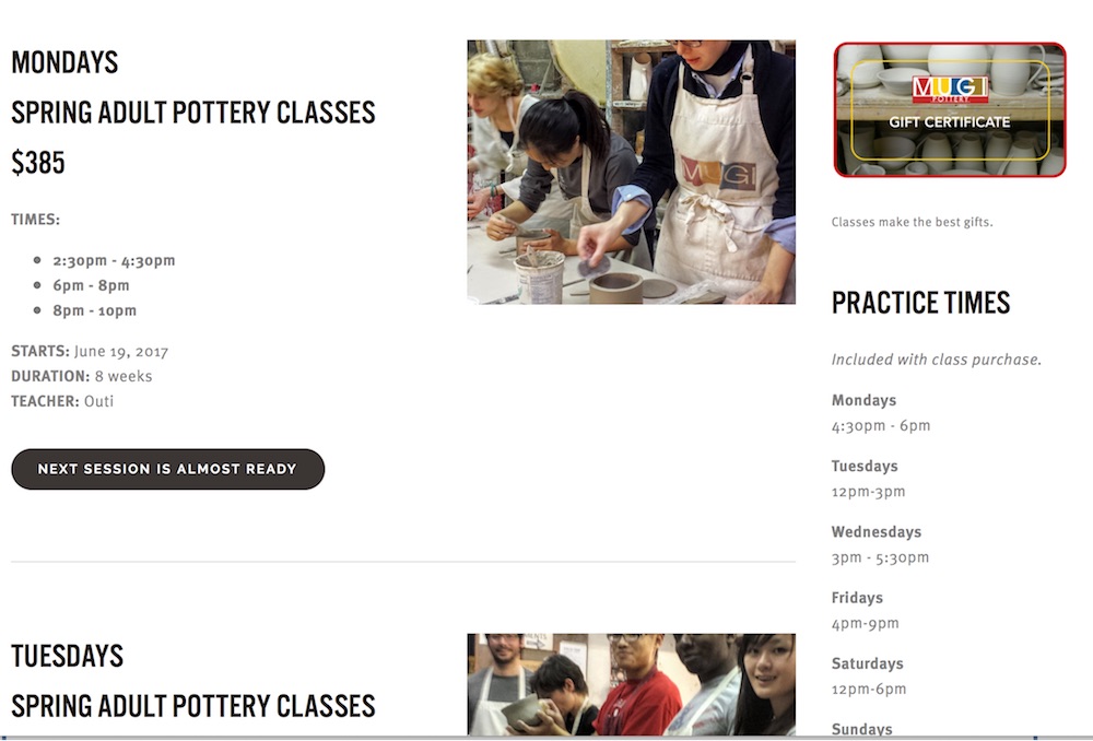
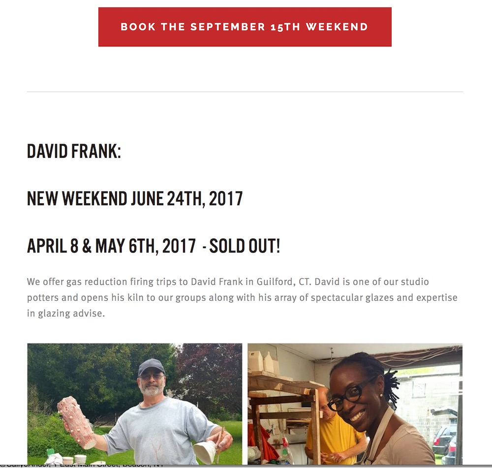
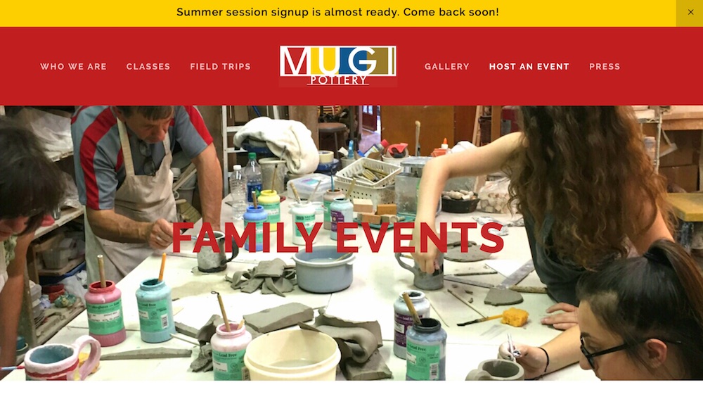
Mugi Pottery is a pottery studio in New York City that started in the early 1990's. We have been a part of its growth since its years in the early 2000s, and were thrilled to give it its third website makeover, this time in Squarespace (the first two times were in Joomla as a custom designed website). Bringing it into Squarespace not only opened the doors to editing the website by the owner, but when she hired someone full-time in house to manage the website, newsletter and registration system, that person stepped into a very easy to use and update website that involved no training or instruction on our part.
Special Features
Brand new look with big pictures of the studio, and use of Galleries to show even more pictures of the classes, field trips, and even video clips from a new video series they started producing.
Newsletter design in MailChimp, matching the look of the website with big red easy "Buy" buttons to make registering for classes seamless.
Integrated the registration system, Occasion, into the page designs. Important to these page designs was maintaining a "product page" type look, but that linked to an external buying page at Occasion.
Utilized Google's G Suite that is connected to Squarespace for business email.
Katie James, Inc.
Special Features
Service-based products clients can buy, including recurring retainer billing.
Easy top navigation with hover option, and easy side navigation displayed for easy clicking.
Liberal use of Squarespace's "blocks" for different ways to break up a lot of copy.
