Website Design

Farm Kits Featured In New Grocery eCommerce Section Of Homespun Foods

homespun farm kits ecommerce.png
Product Image Design: Katie James, Inc. Illustrations: birdiydesign

Product Image Design: Katie James, Inc.
Illustrations: birdiydesign

Homespun Foods has brought back their Farm Kits - a creation during the early pandemic days when they needed to survive during the shutdown. Katie James Inc. Was able to create this new Grocery section for them in their Squarespace website, with Farm Kits being the first product. We opted to create an ecommerce section called “Grocery,” where all food products can go in, and auto-populate. Homespun staff will be trained in how to create a Grocery product so that the section can build itself. Of course, Katie James, Inc. can do it for them in our Pay As You Go program if they get too busy in the kitchen.

Most likely, other retail items like Honey and Maple Syrup are next to be added to the Grocery section.

Farm Kits are offered in limited supply, in Quantities of 12 bags each week. We utilized SquareSpace’s Variant option to create a different day for which someone could order. Maintenance will require removing the day once it has passed, and adding the next week’s day. A “How It Works” section was also added to the sales page, to educate people in how it works, in order to provide them with expectations for no surprises later on.

We designed the product image to be reflective of what might be in the seasonal bag of fresh grown food, putting it on a black chalkboard. The chalkboard is a signature look inside of Homespun, as they have their menu board on a chalk board across from the register. Homespun is all about good food and working with one’s hands, so the scratchy look is on-brand for them.

Being that the Farm Kits are a joint offering between Homespun and Common Ground Farm, both of Beacon, NY, we included both logos to help identify both brands as the image passed through social media, newsletters and advertisements.

Need an enhancement for your website or a fresh pair of eyes? Katie James Inc would love to help. Reach out ☺️💕

Illustrations from clip art created by @birdiydesign on @creativemarket 💜

Need enhancements done to your website or brand overall? Hit us up :)

New Website Design By Katie James, Inc. ; Barb's Butchery

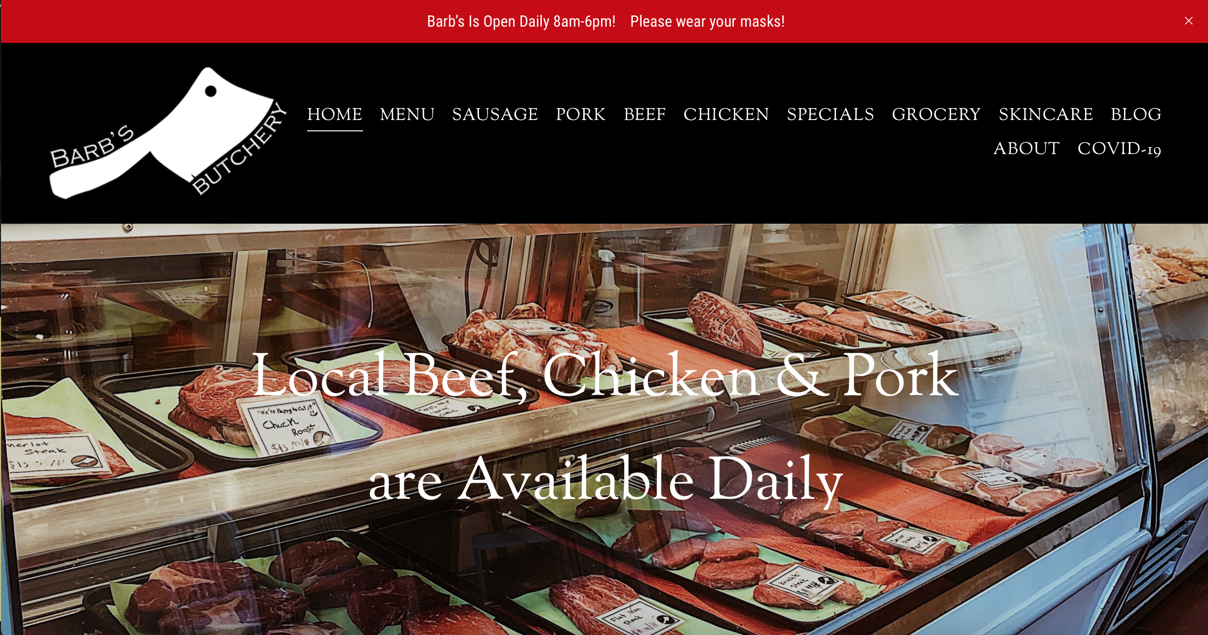
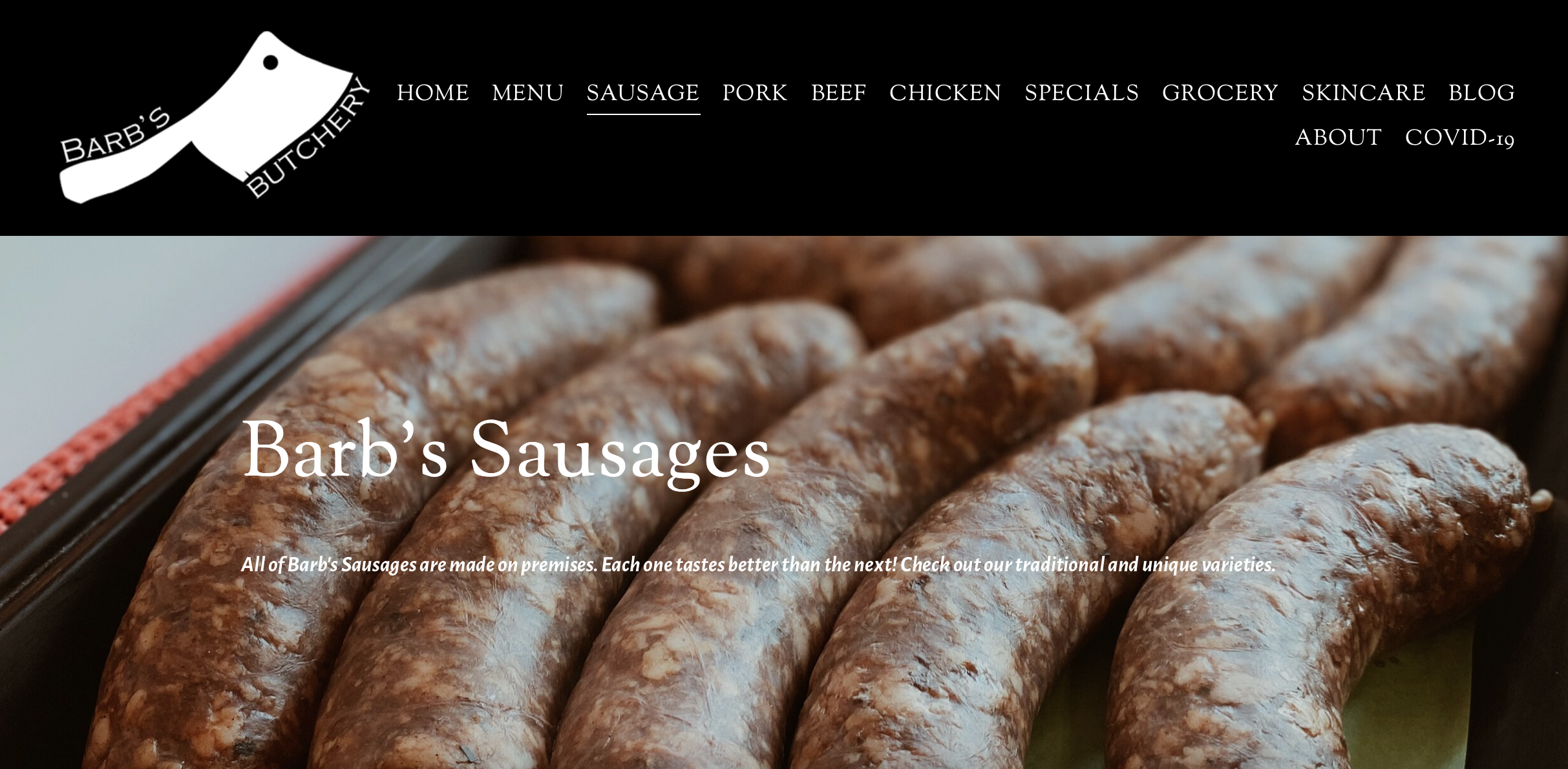
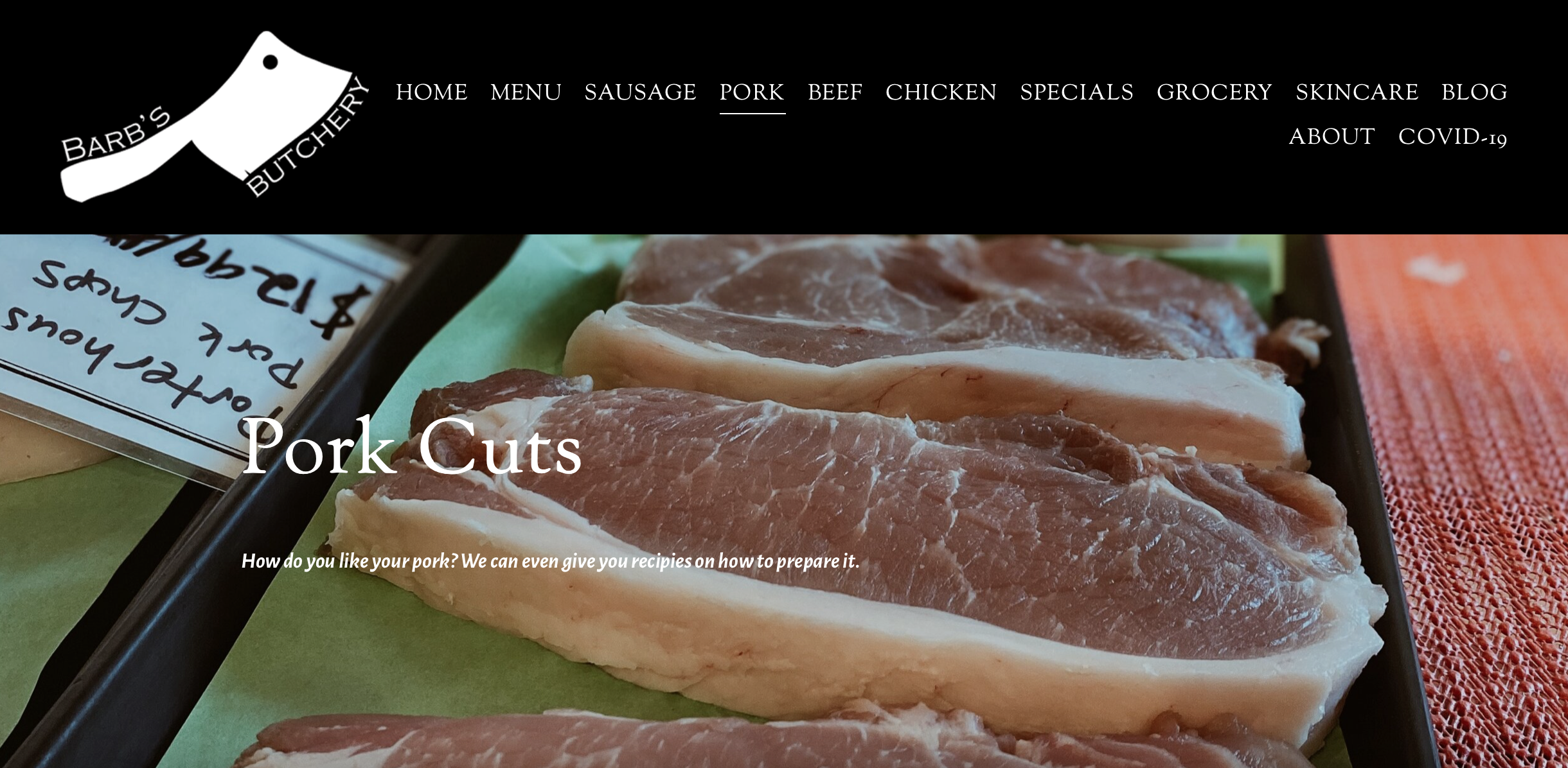
Barb’s Butchery New 2021 Website

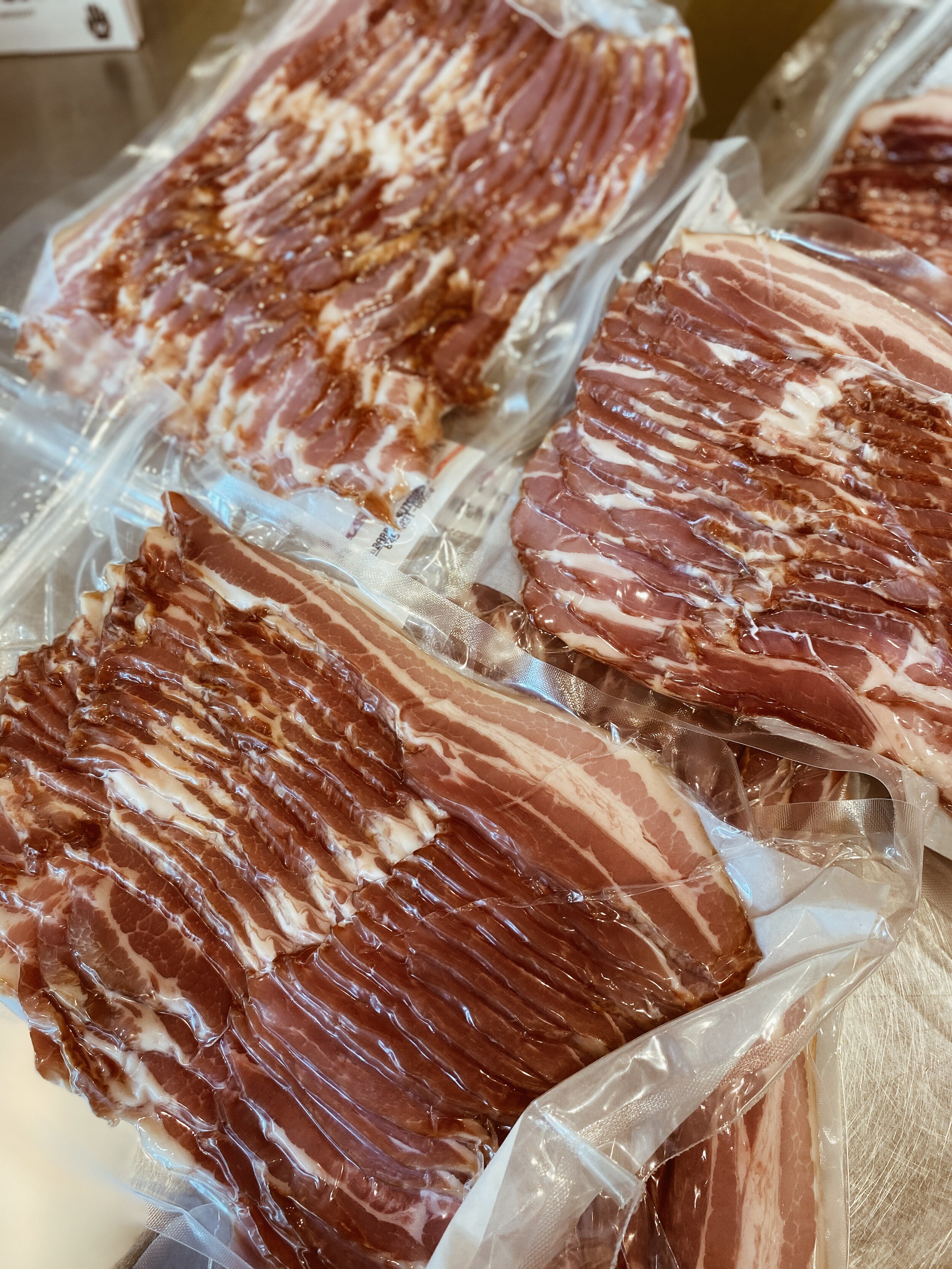
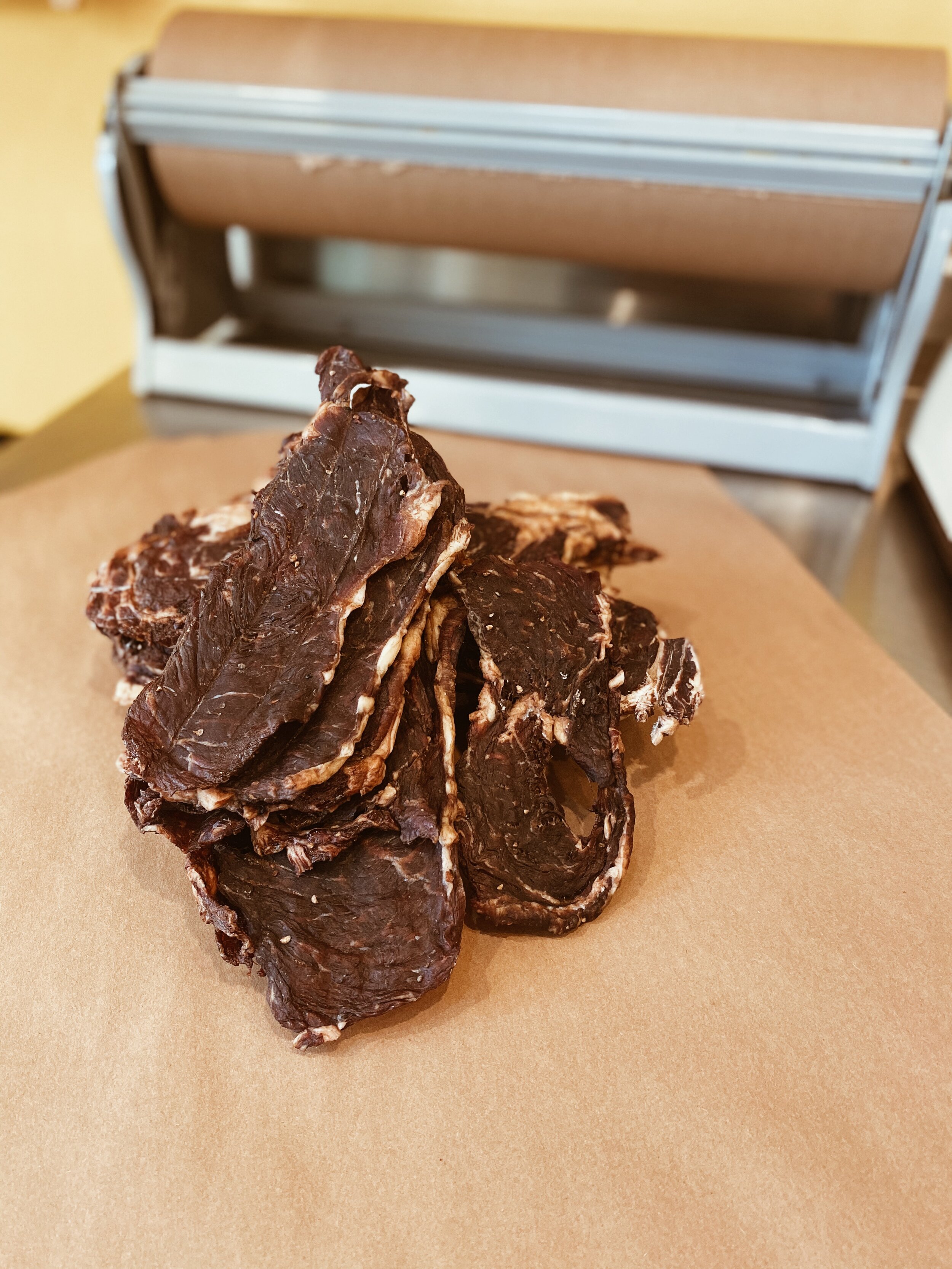
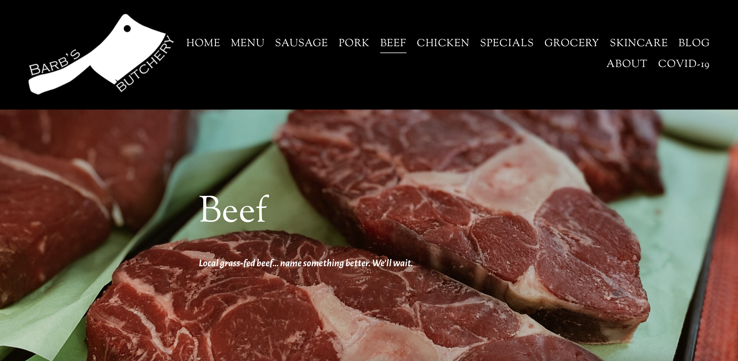
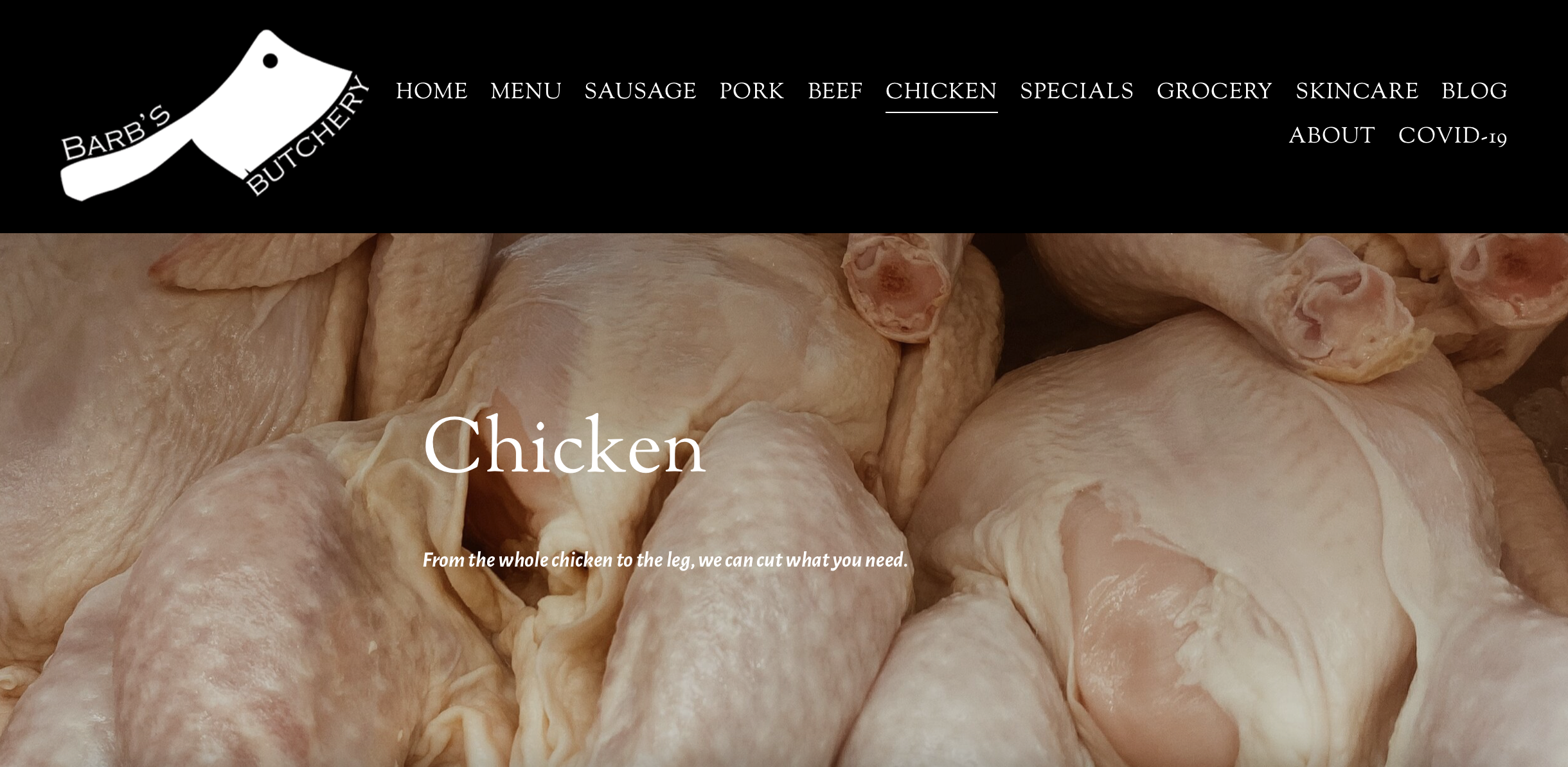
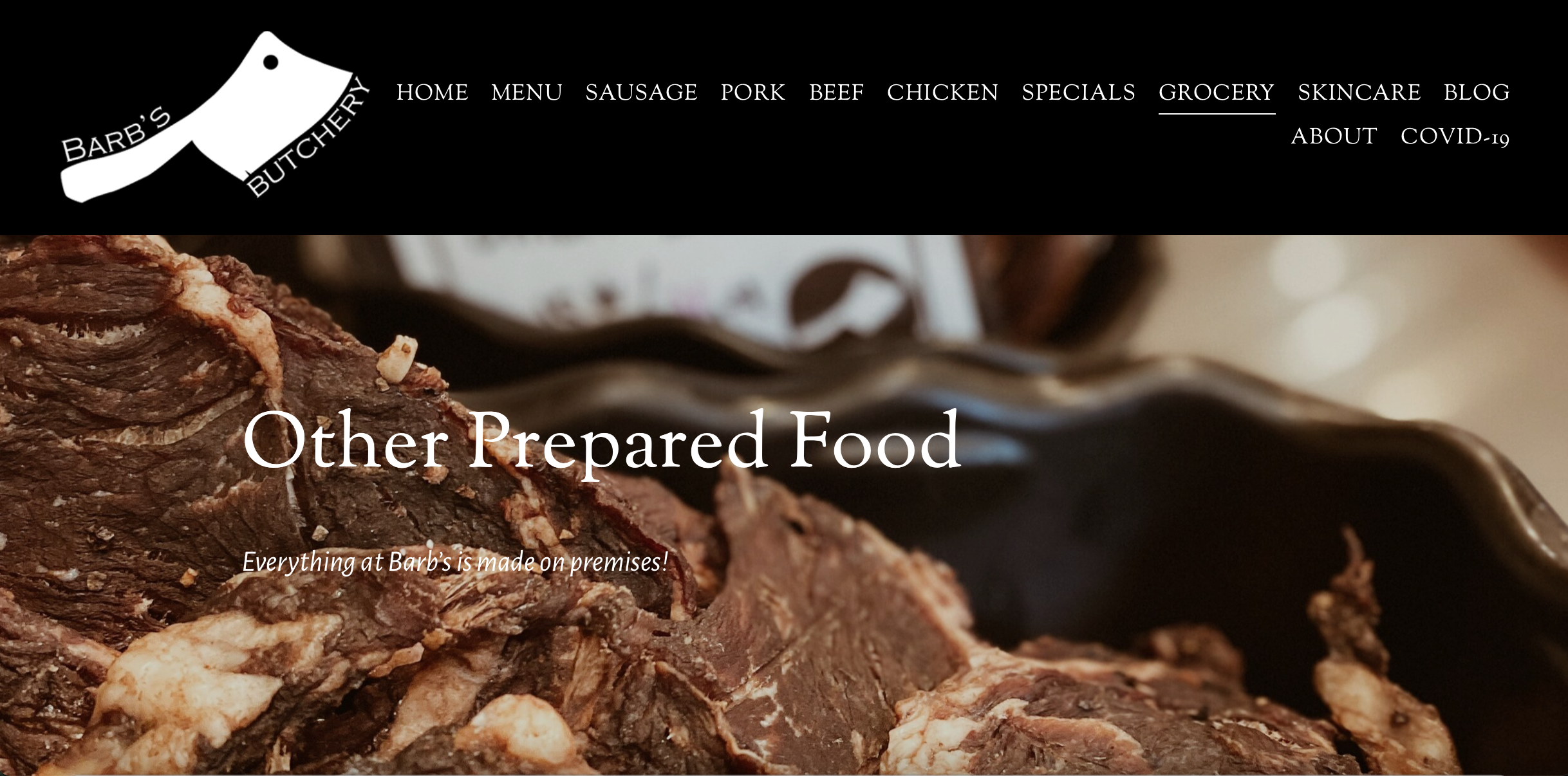
After several years in business, Barb’s Butchery was ready for Version 2 of their website. Adding to the website whenever she wanted was the #1 priority for Barb. The #2 priority was to have all of her offerings be better organized.

We approached the project with this in mind, and gave each main offering its own designation in the top navigation, so that customers could see what was there.

Specials are very important to Barb’s Butchery, who has been putting out the monthly discount special for years.

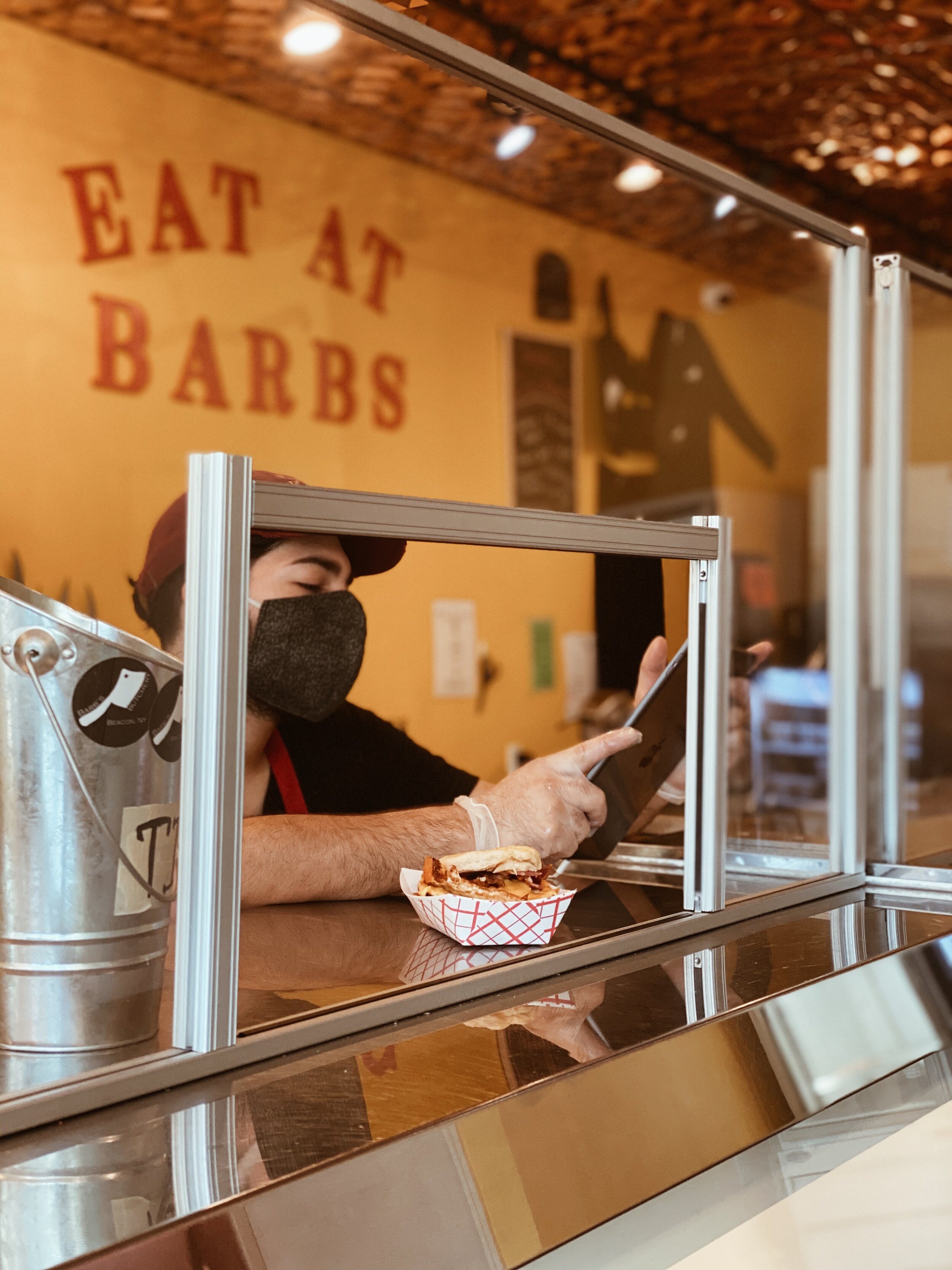
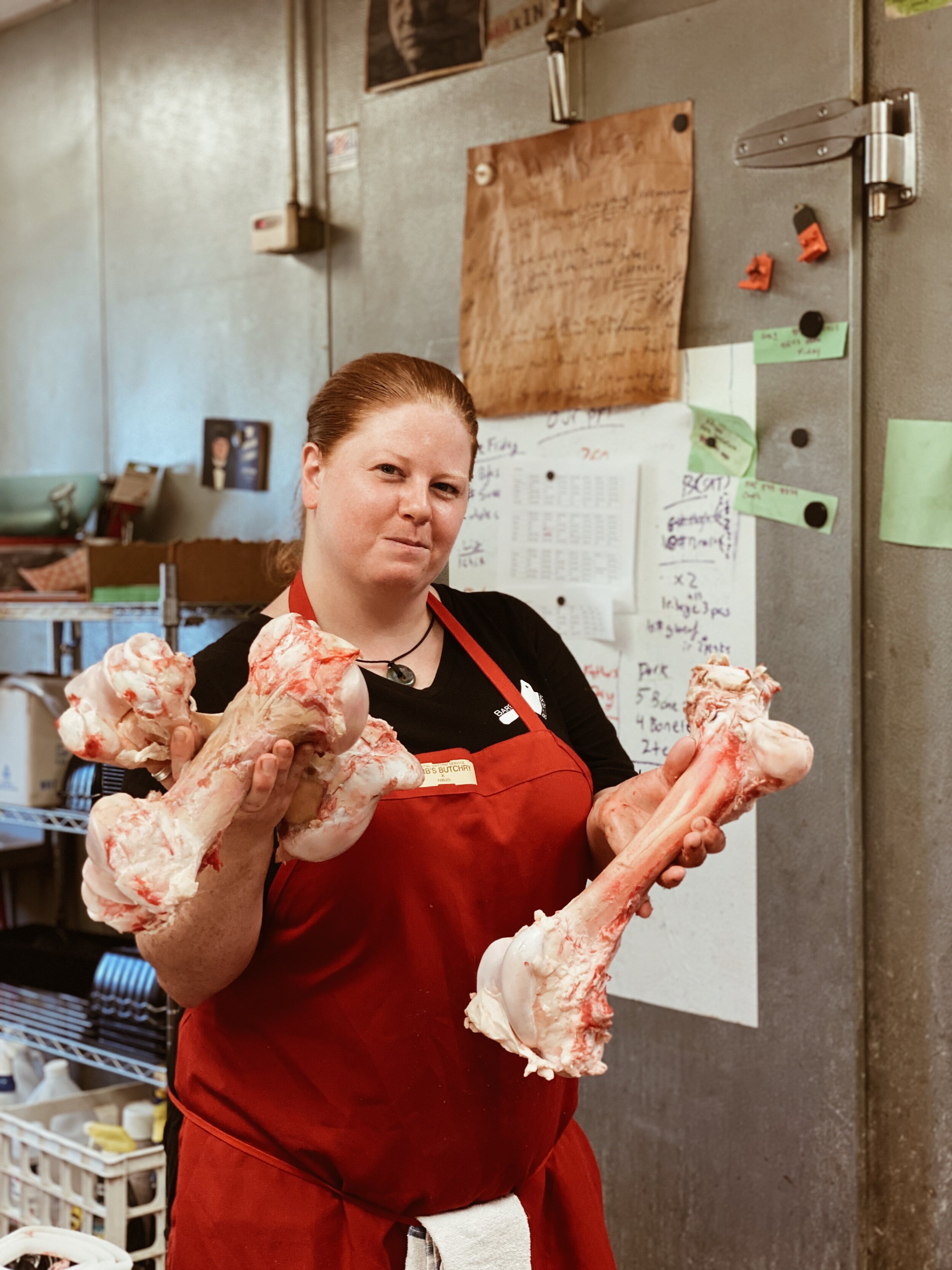
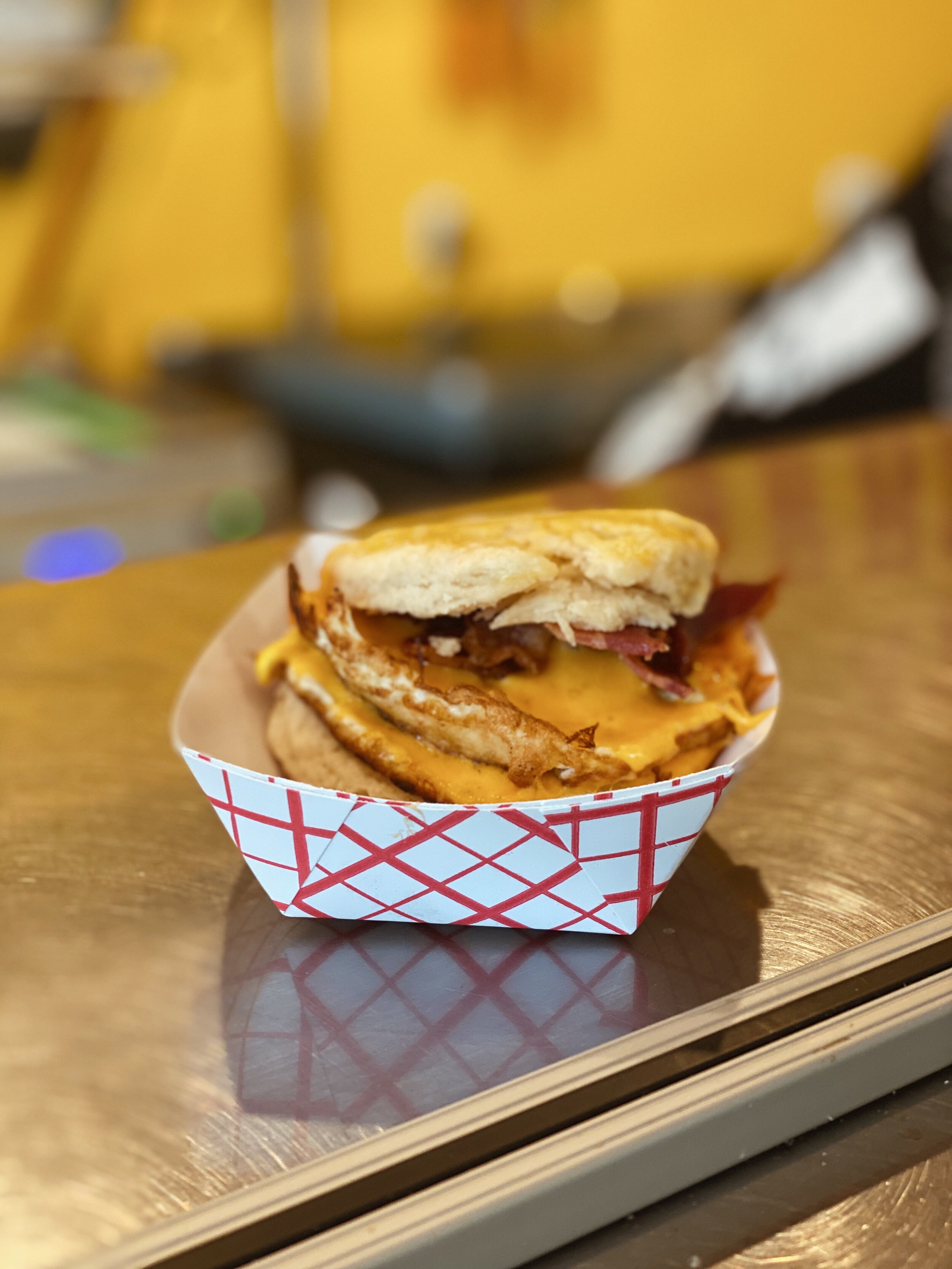
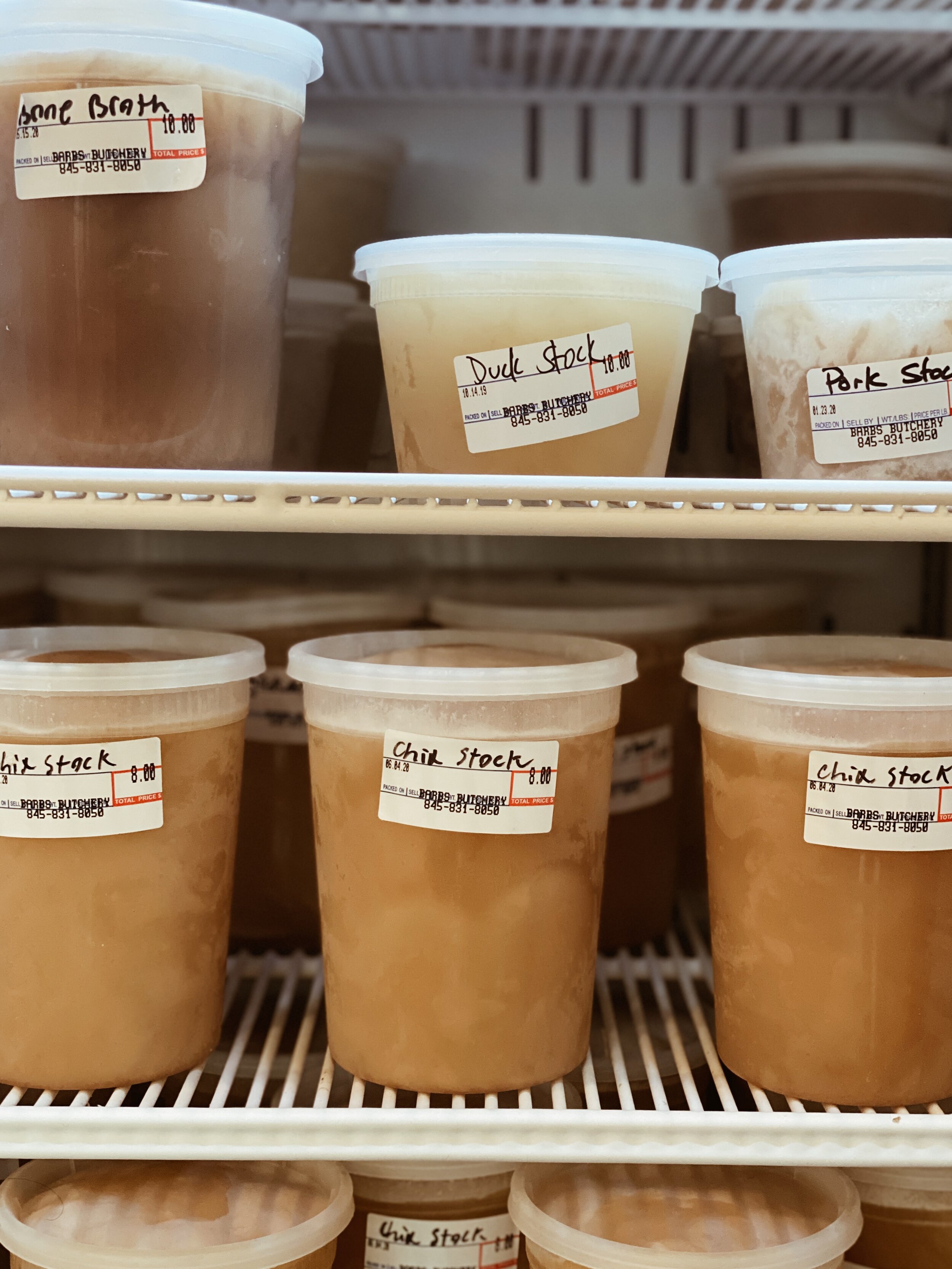
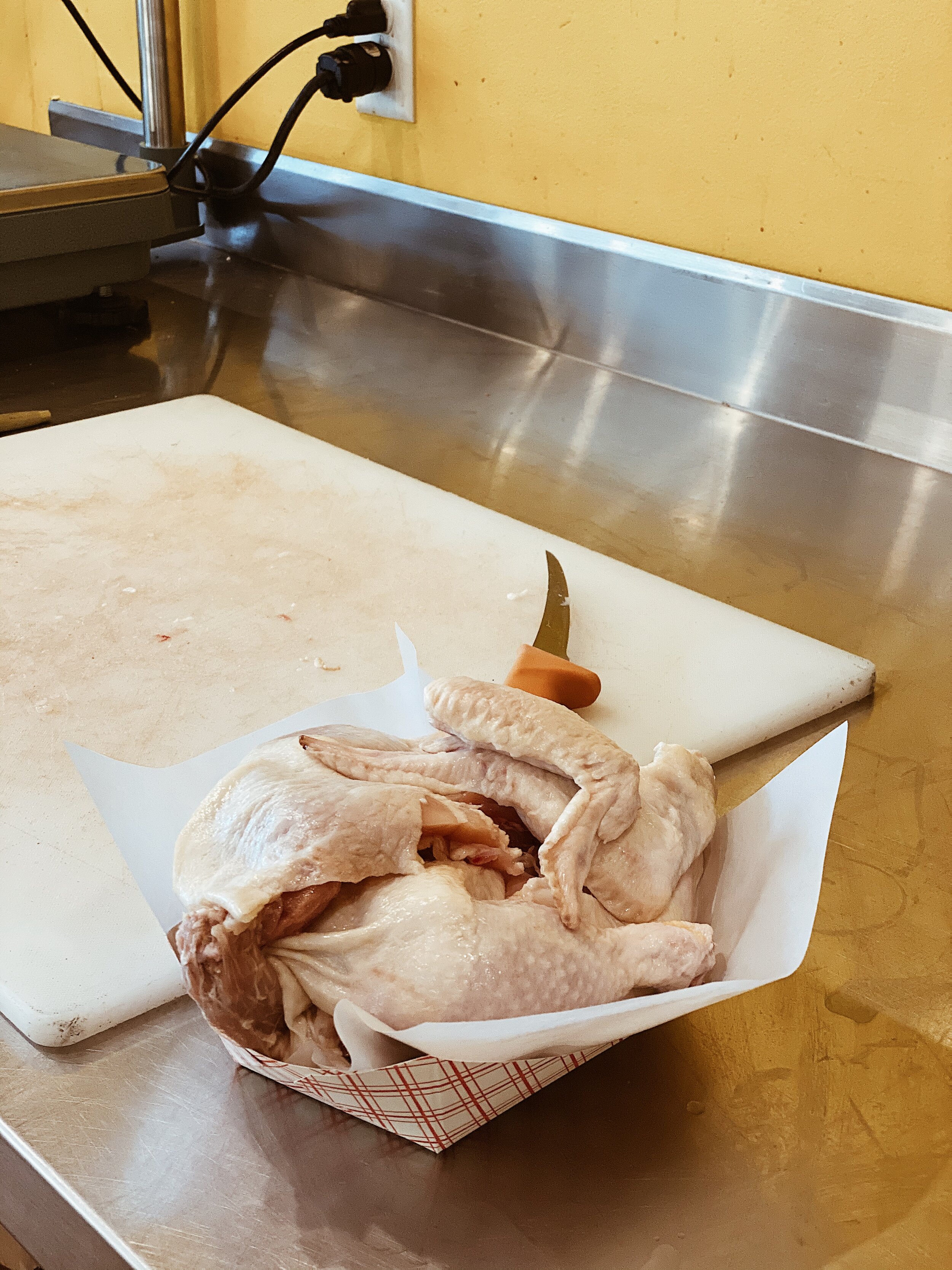
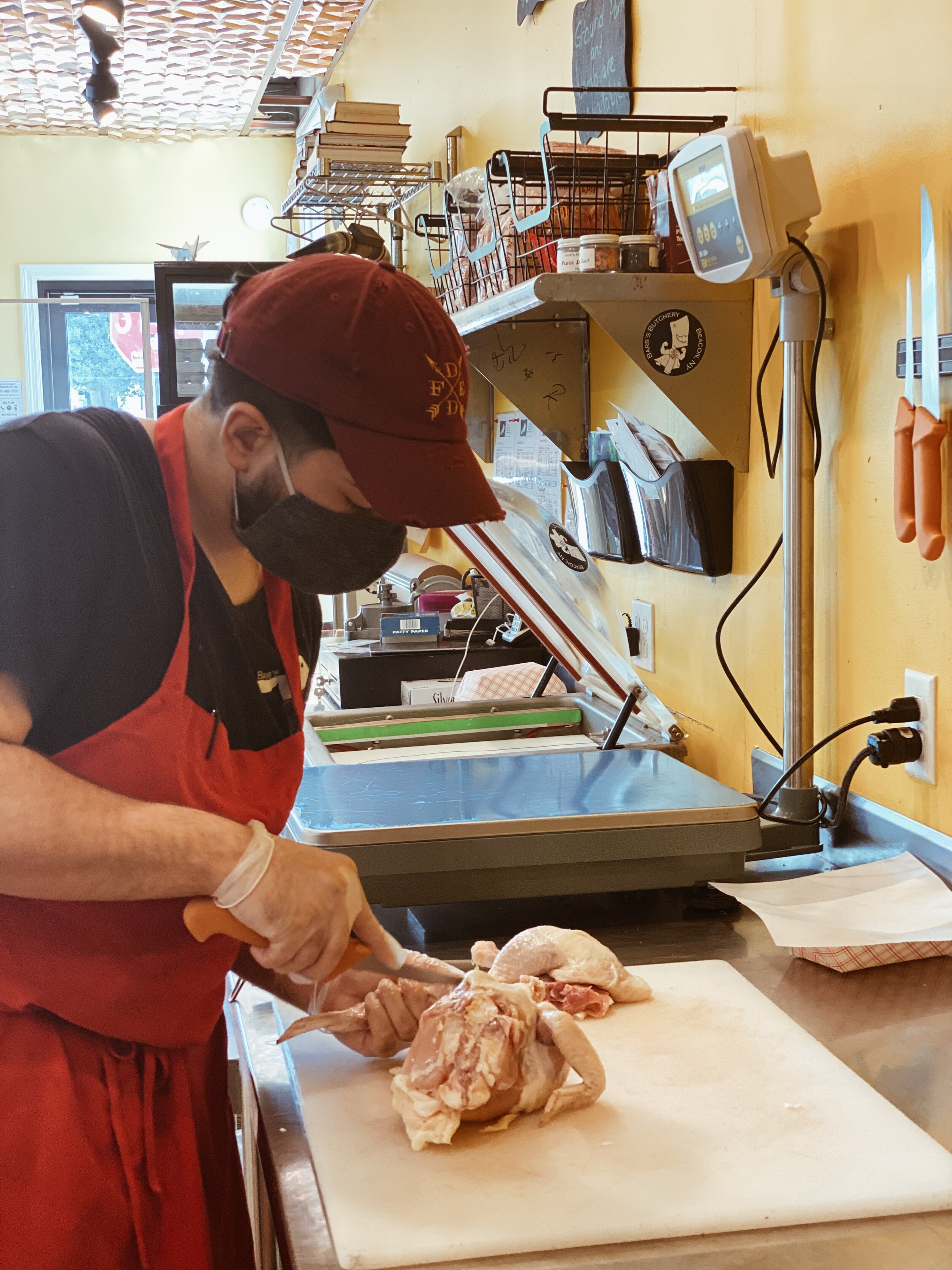
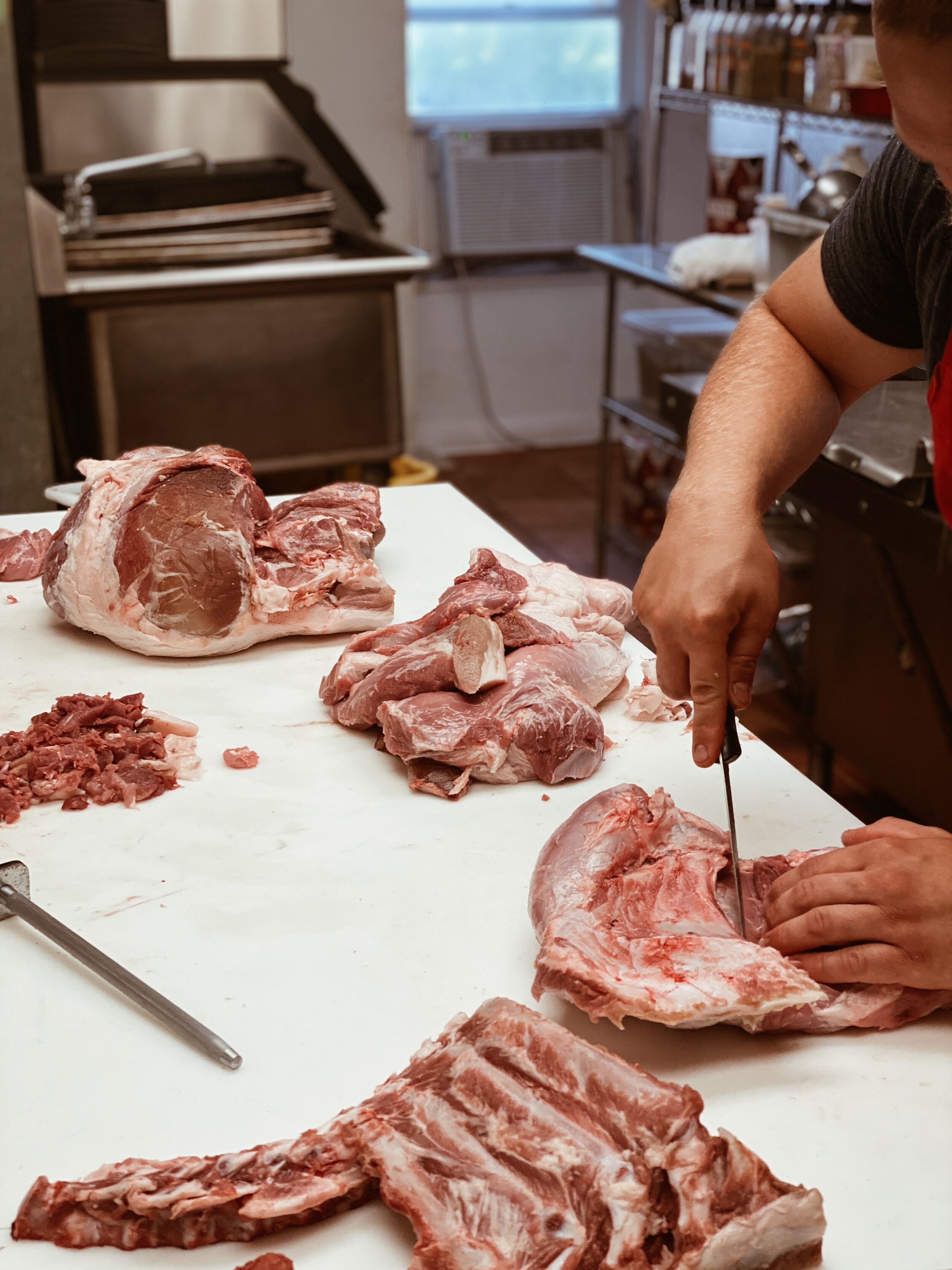
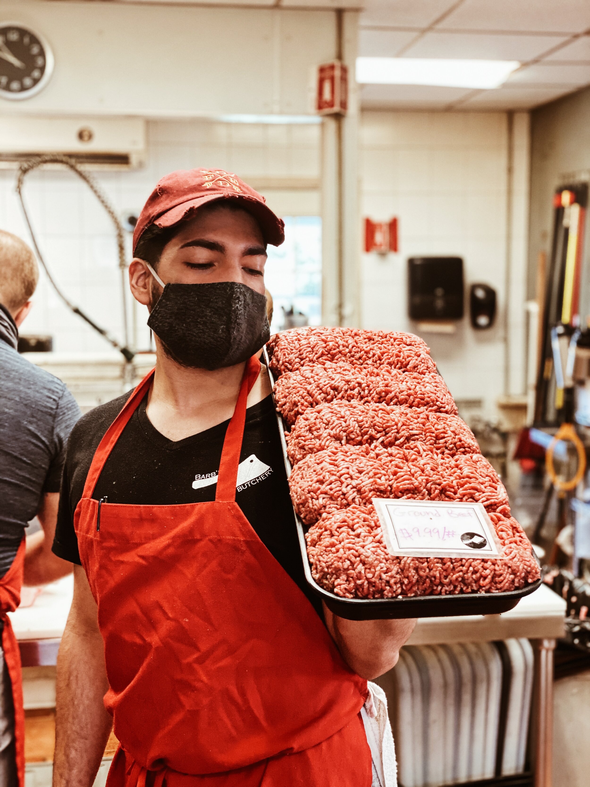
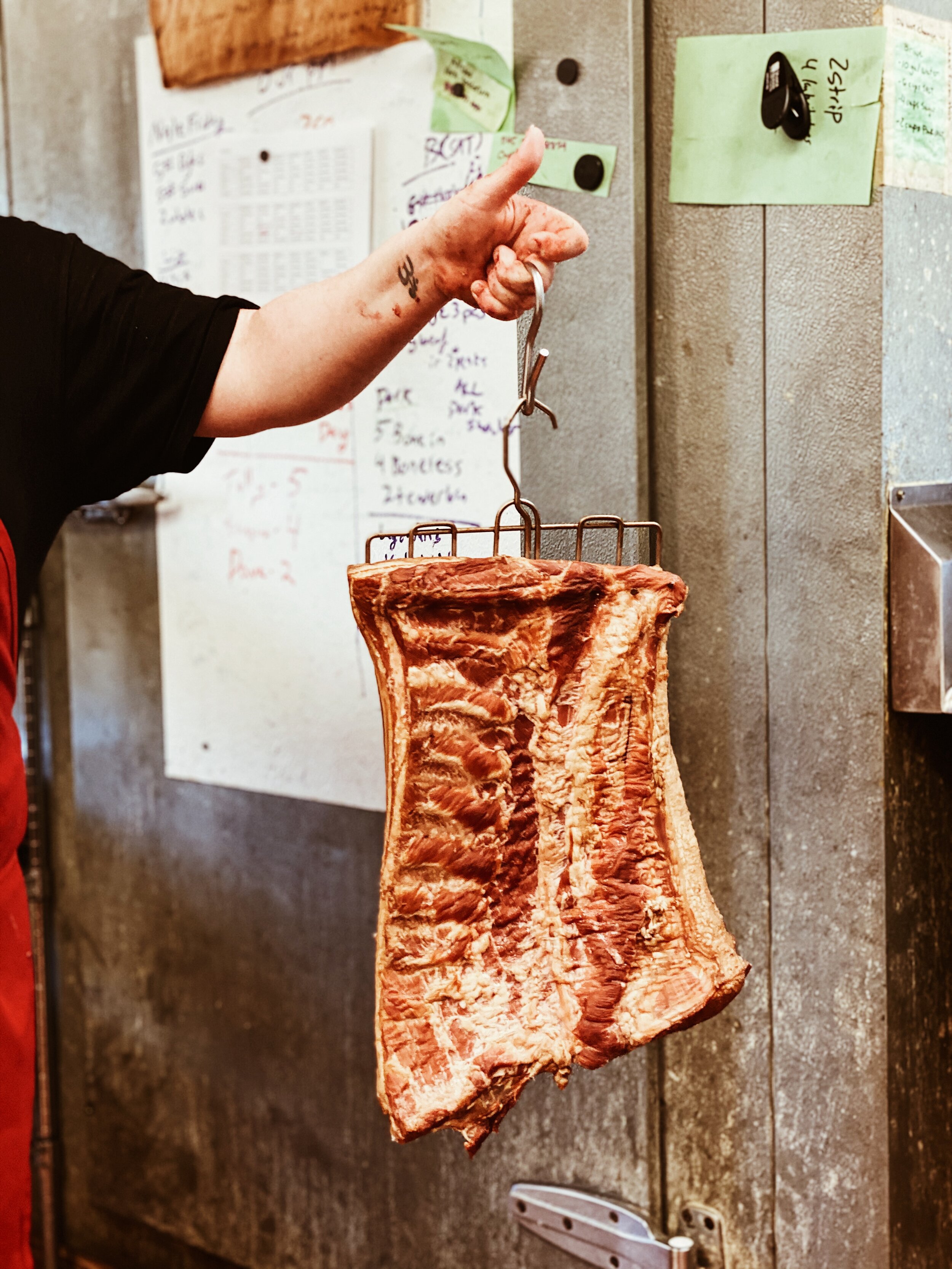
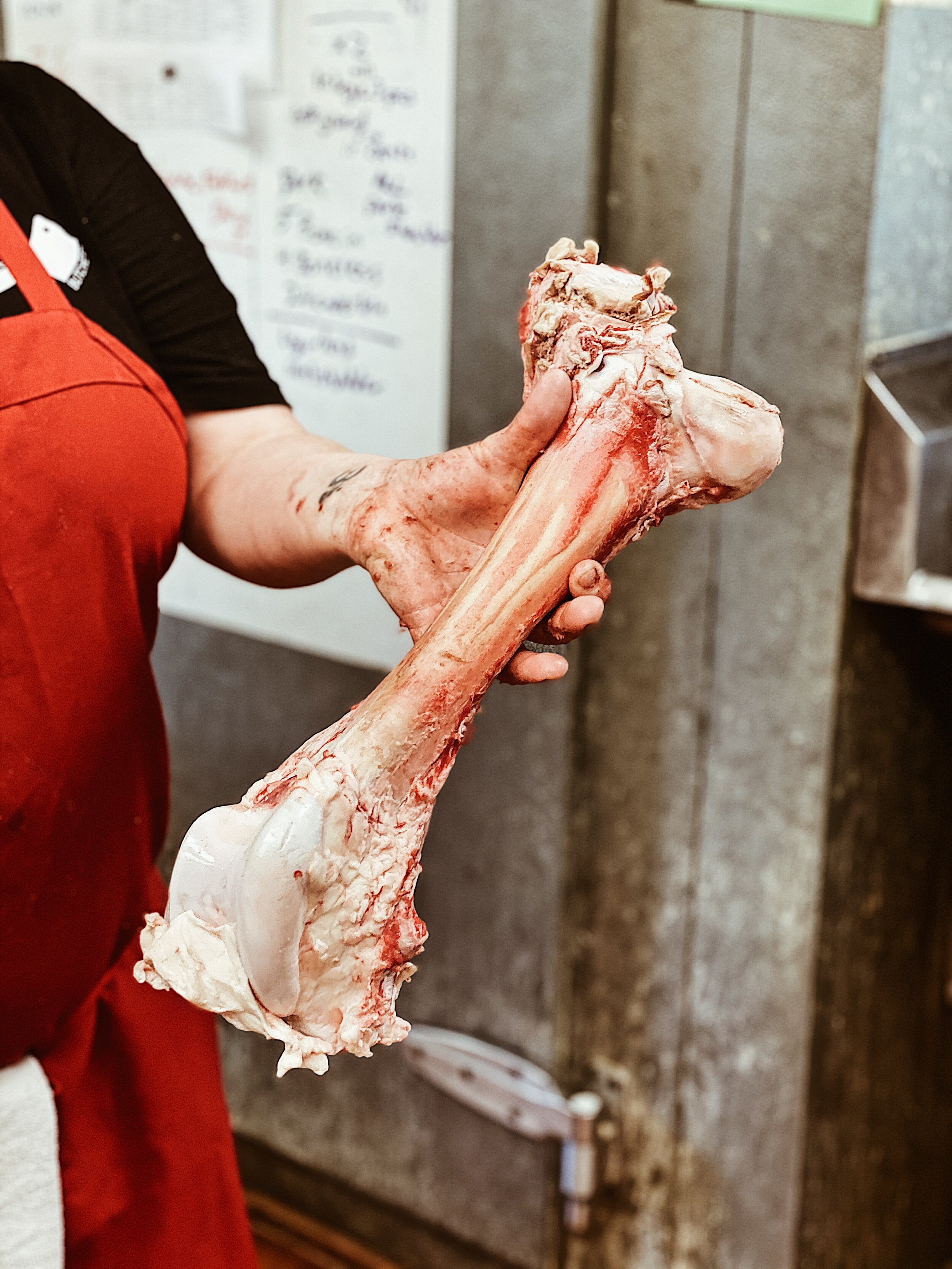
We were also able to go in for a small photo shoot, to add new photos to the website and show COVID-19 safety guidelines in place. Teslie Andrade was the photographer on this project.

Photography in the shop while the employees were there, to get nice action and ambiance shots.

We kept all of the content from Barb’s Butchery’s old website, and arranged it with the new photo and type treatment on new pages

Training Session With Knot Too Shabby, An Annie Sloan Home Stockist

Training Session with Caryn of Knot To Shabby as we finalize her website (which has already been processing workshop and paint orders since our pre-launch). She’s a great learner, ready to dive in and wants to get under the hood of this Shopify website to update her home page with creative new collections! Watch for her monthly feature.

Newsletter hookup with MailChimp is next, and then this Shopify project is wrapped (this stage, at least!). Annie Sloan Home and complimentary stencils and furniture was never so easy to buy online! Knot Too Shabby can reach beyond her immediate local in Beacon, NY, to other local who travel to Beacon for free pickup in her shop.

To get a Katie James, Inc. website, simply visit our Services pages to see how we can help. 

IMG_7246.JPG

Website Design Phase 1 Complete for the Telephone Building Beacon

Website Design Phase 1 done for Deborah Bigelow’s the Telephone Building in Beacon NY. This is the second time her renovation work of the building has gone online, but this time at its own website, very clearly, with lots of Before and After shots, as well as a gallery of how the building looks today. Find the website at www.telephonebuildingbeacon.com


Really an honor and a pleasure to work with Deborah (my office landlord) on this, to listen to her direction and learn where she’s going. Her ❤️ heart has been in this building for so long, as evidenced by business owners around here who see her working on it almost every day. Either cleaning cigaret butts from the sidewalk, or up on a boom laying gold leaf gilding papers on the letters atop the building.

Bravo, Deborah.

IMAGE.JPG
Video Block
Double-click here to add a video by URL or embed code. Learn more

Website Design Planning for Telephone Building

Love it when websites take shape on the table first. Deborah Bigelow, owner of the Telephone Building in Beacon, is a very visual thinker and has a process of discovery. She plots things out in binders and boards and delivers them to our meetings. The website is taking shape nicely, and telling the story of the Telephone Building’s 25 year history in Deborah’s hands.

IMG_4919.PNG
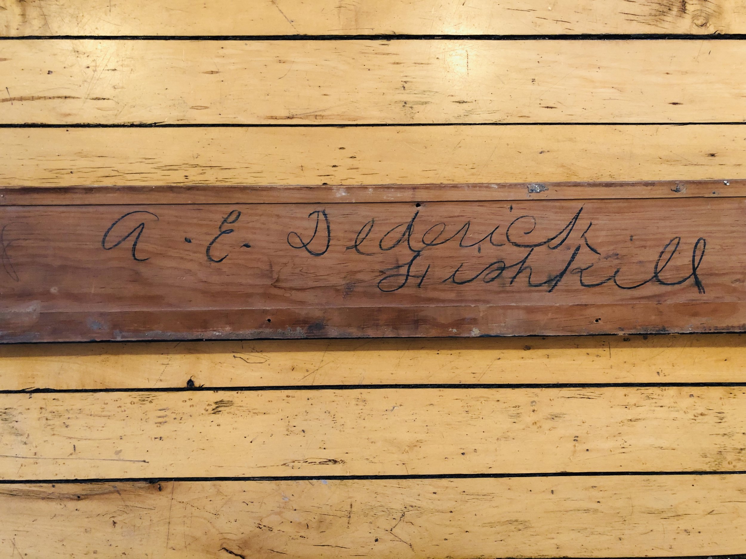
FullSizeRender.jpg

This is a photo of an original plank of wood that served as the architect’s signature that Deborah discovered while she was renovating the Telephone Building.   

Launched! The Telephone Building at 291 Main Street

Deborah Bigelow is the modest owner of one the historic buildings in Beacon, NY. She is a guilder by trade, and a master renovator. But she's inside or outside of the building most of the time, restoring it, cleaning it, protecting it, and nurturing her tenets.

Most people who drive by the building or might need it for some reason don't realize that it's Deborah's hand who maintains it. IN 2017, she decided to put The Telephone Building on the map - the digital map - and give it a digital footprint, in addition to the parcel spot it occupies at 291 Main Street in Beacon, NY.

Deborah is also our landlord! And she's one of the best in Beacon. I was happy and honored when she asked if InHouse Design Media could design her first website. The first version of her website was launched in June 2017. She has big plans, but wanted to get a placeholder page up that presented the building, and had a contact form for people to reach her with building inquiries.

More About The Project

The Telephone Building

www.telephonebuildingbeacon.com

Launched: June 2017

Deborah Bigelow is a restoration artist who works within her company Gilded Twig. Gilding in gold is her specialty. Little known is her business of owning and restoring a building. In the late 1990s, Deborah bought a building at 291 Main Street that was an original Telephone Building built in 1907. This building became her artistic project, and she has restored all of it. The building's offices are rented out to different tenants. In 2017, Deborah was ready to brand the building and her second business, 291 Main Street LLC. 

Special Features

  • The website is on one page, which is essentially a Cover Page. While we did not use the actual Cover Page tool in Squarespace, the effect is the same, yet with more depth.
  • The website can easily be expanded with more pages and photos when the client is ready.

If This Little One Can Jump Into Squarespace...

IMG_2058.JPG

The littlest one on the team...she wanted to "hang out" tonight after watching her shows, so she got to finish setting up an intake form for our client Gilded Twig who is launching a website for her business, The Telephone Building. The building and the work she has done to it is getting its own website. Reveal to come!


Point of this photo is, if little Ruby can eagerly jump into a webpage in Squarespace to want to know how to set it up, so can you! Just double tap and drag. Have your audience in mind of how easily you want them to see it and experience something. If Squarespace still stumps you, or if organizing and presenting your website as a whole remains overwhelming to you, thus stopping you from creating this big impact on the web, then contact us. We can train you or do it for you with your guidance. Every project is  different, and we enjoy getting to know your brand.

Cyber Monday Sale: 20% Off Digital Marketing and Website Design

Last day for our Cyber Monday sale on Website Design + Digital Marketing Services. This sale never happens, so here are the details that are good until midnight tonight:

PERSONAL TRAINING: 20% Off any already discounted package. Katie can help you plot out your website, make your social streams look good and be compelling, understand SEO, help you with your blog ideas to attract people from Google and shop from you (even if you sell time/services), etc.
Details and Buy Here (prices slashed, no coupon necessary)

WEBSITE DESIGN: 20% Off the First Time Website Design Package. Great for brochure websites, and even with light ecommerce. Those of you selling services, Katie can help you think up packages that can be purchased online, or ways to skip the invoicing step.
Details and Buy Here (prices slashed, no coupon necessary)